Mount St. Louis Moonstone

Client:

Mount St. Louis Moonstone

Services:

  • Brand Identity
  • Logo Design

THE OPPORTUNITY:
As Mount St. Louis Moonstone prepared to celebrate its 60th anniversary, the resort wanted to create a commemorative identity
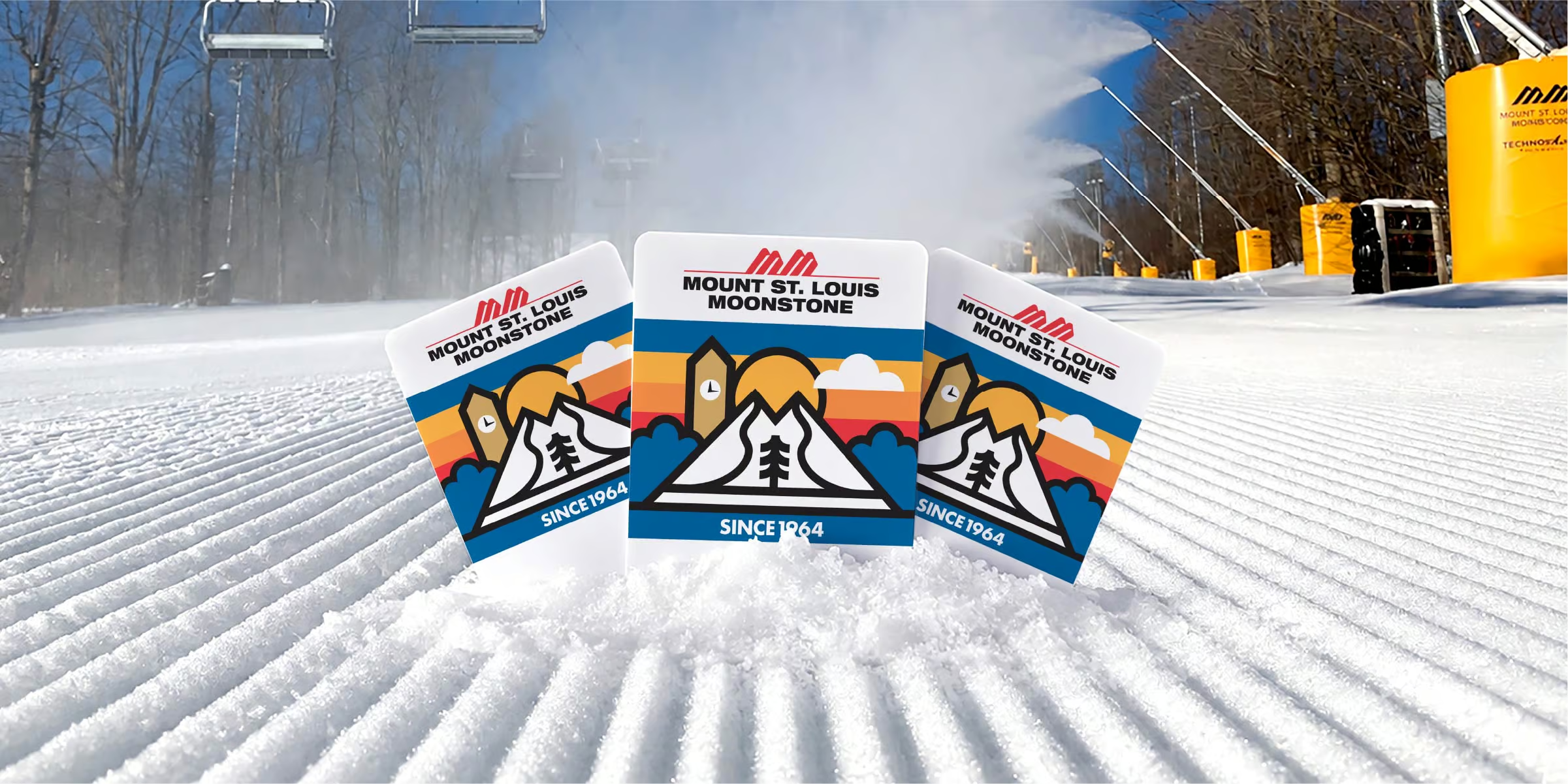
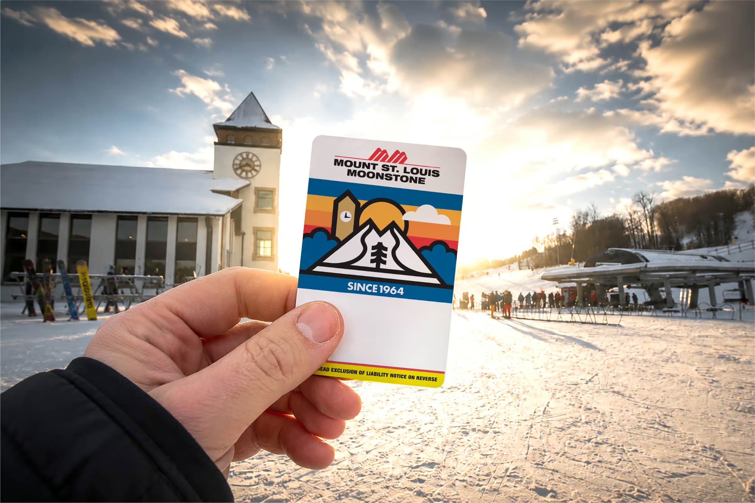
that honoured its heritage while refreshing one of its most visible guest touchpoints: the RFID season pass. More than just a lift ticket, the reusable pass travels with guests throughout the season and often for years afterward, making it an opportunity to strengthen the brand long after the first visit. Alongside the RFID pass, the anniversary branding needed to celebrate six decades of family ownership while remaining timeless, memorable, and instantly recognizable.

THE SOLUTION:
I developed a retro-inspired visual identity rooted in the character of
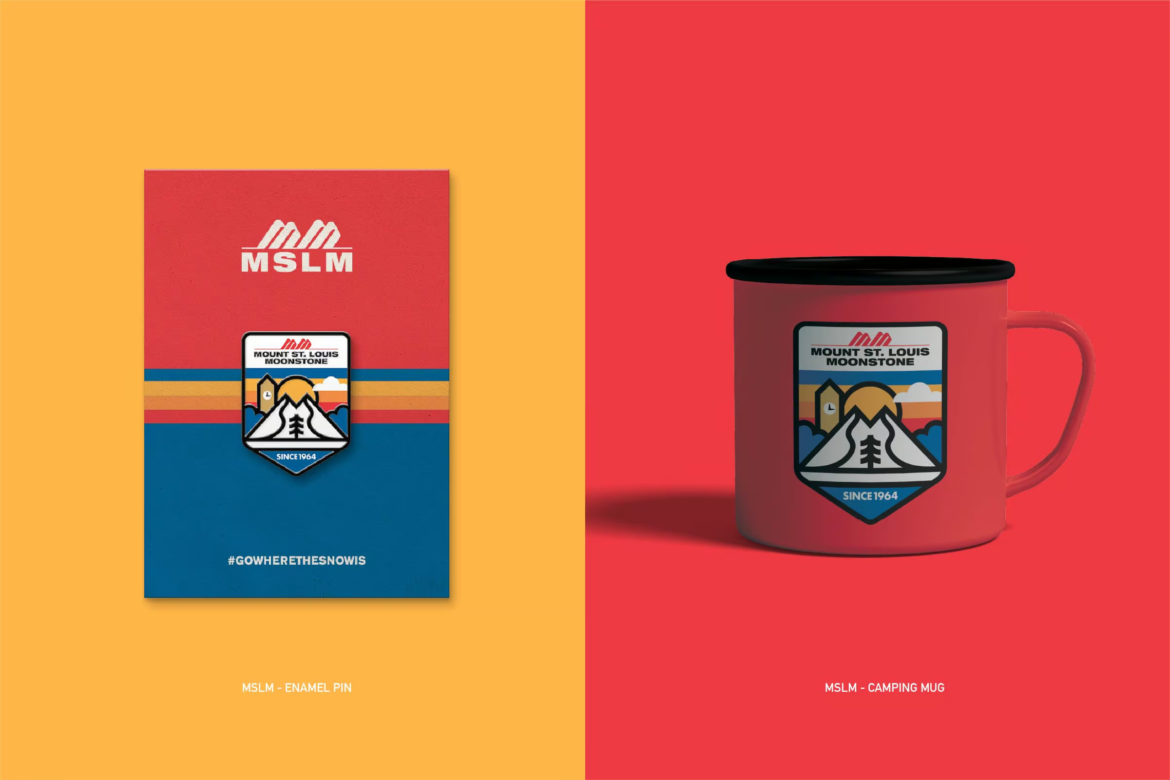
the resort itself. The iconic clock tower, twin peaks, evergreen tree, and clean alpine geometry came together in a bold anniversary crest that celebrates Mount St. Louis Moonstone’s history while reflecting
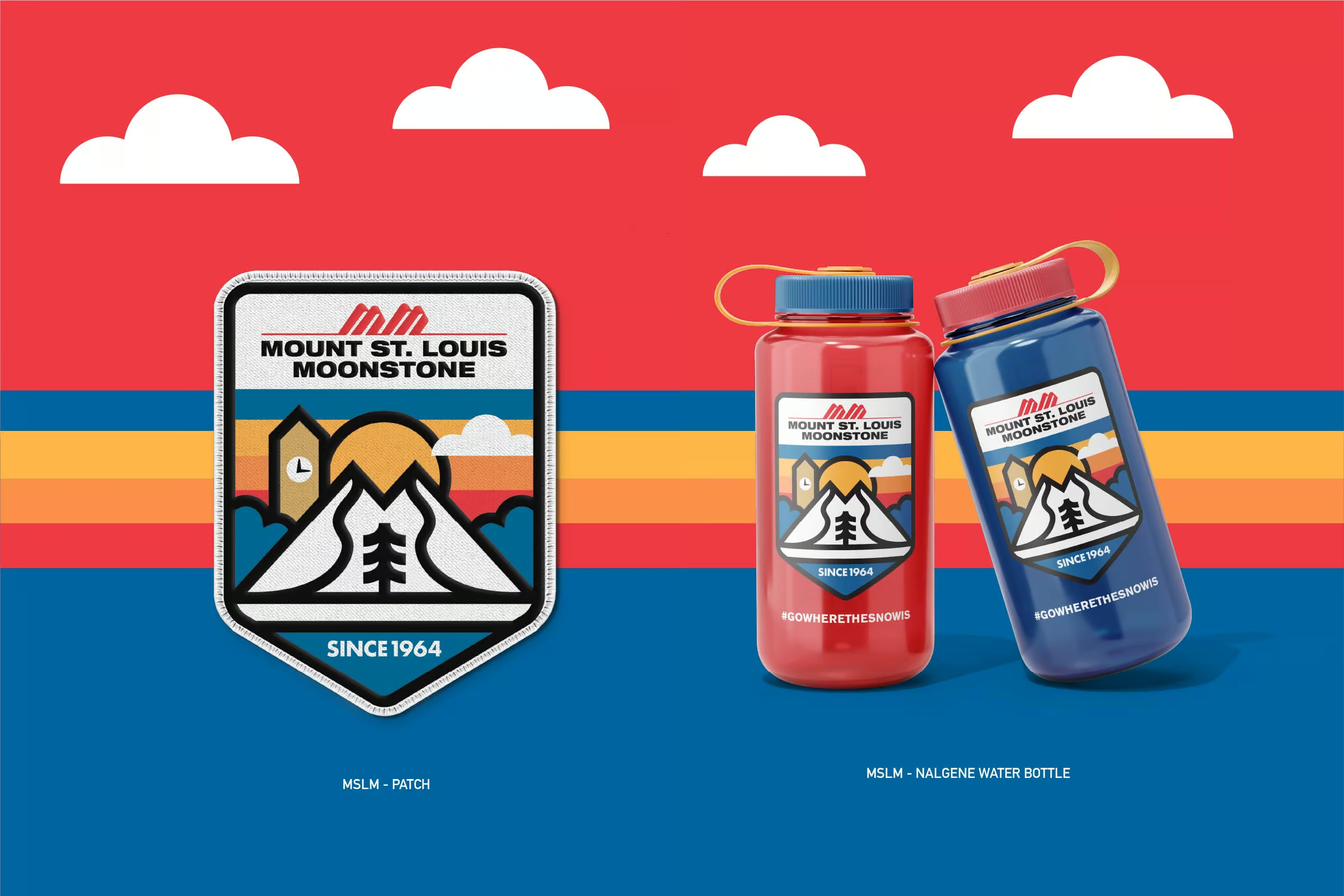
the precision, craftsmanship, and exceptional snow conditions the resort is known for. In addition to the commemorative 60th anniversary logo, I designed a graphic system that extended seamlessly across the RFID passes and into a collection of merchandise concepts, creating a cohesive brand experience beyond the slopes.

The response exceeded expectations. Guests began requesting the new RFID design, with many choosing to replace perfectly usable cards simply to own the updated artwork. What started as a functional access pass became a collectible piece of branded merchandise, demonstrating how thoughtful design can elevate even the most practical product into something people genuinely value and want to keep season after season.
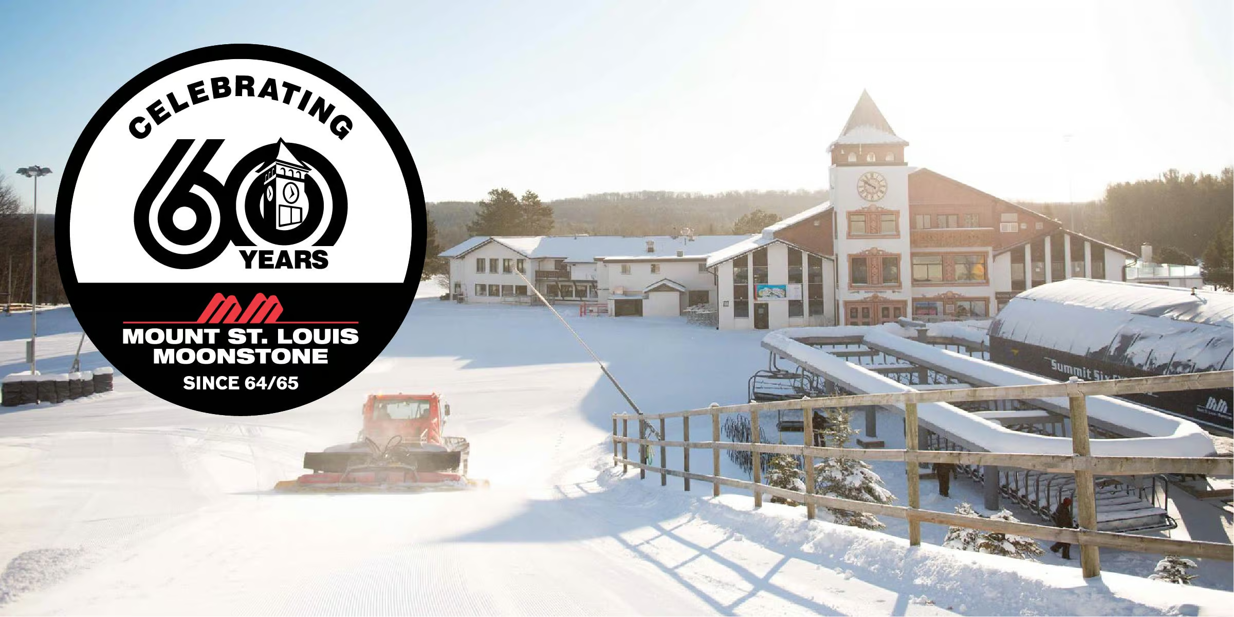
60 Years Logo

I also created a commemorative badge that puts Mount St. Louis Moonstone’s clock tower inside the “0” of 60, making a familiar part of the resort central to the anniversary mark. The circular design brings together the milestone, the mountain logo, and the resort’s founding season in a compact identity. It celebrates six decades of family history while giving the resort a graphic it can use across passes, merchandise, and anniversary materials.