THE OPPORTUNITY:
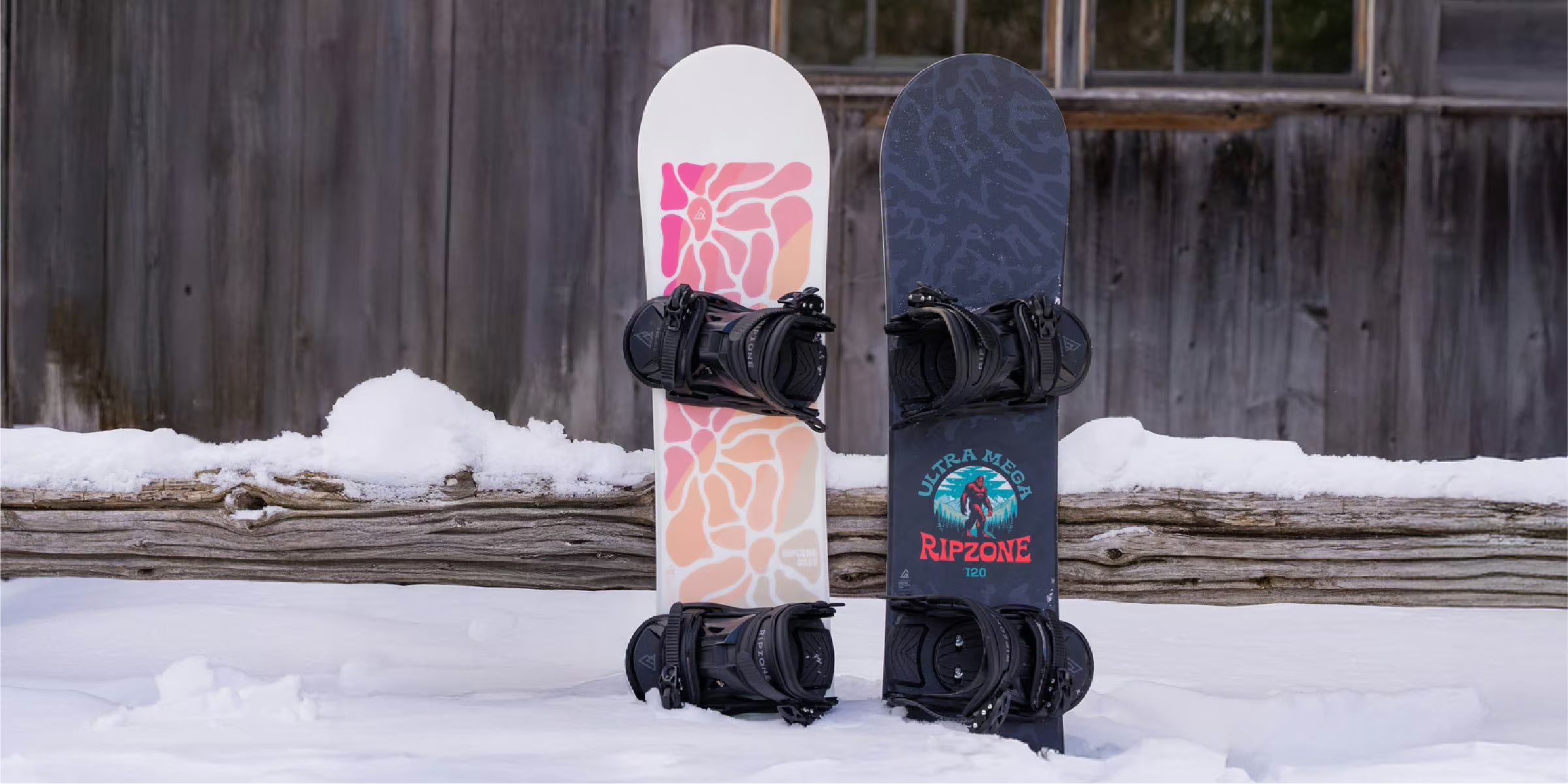
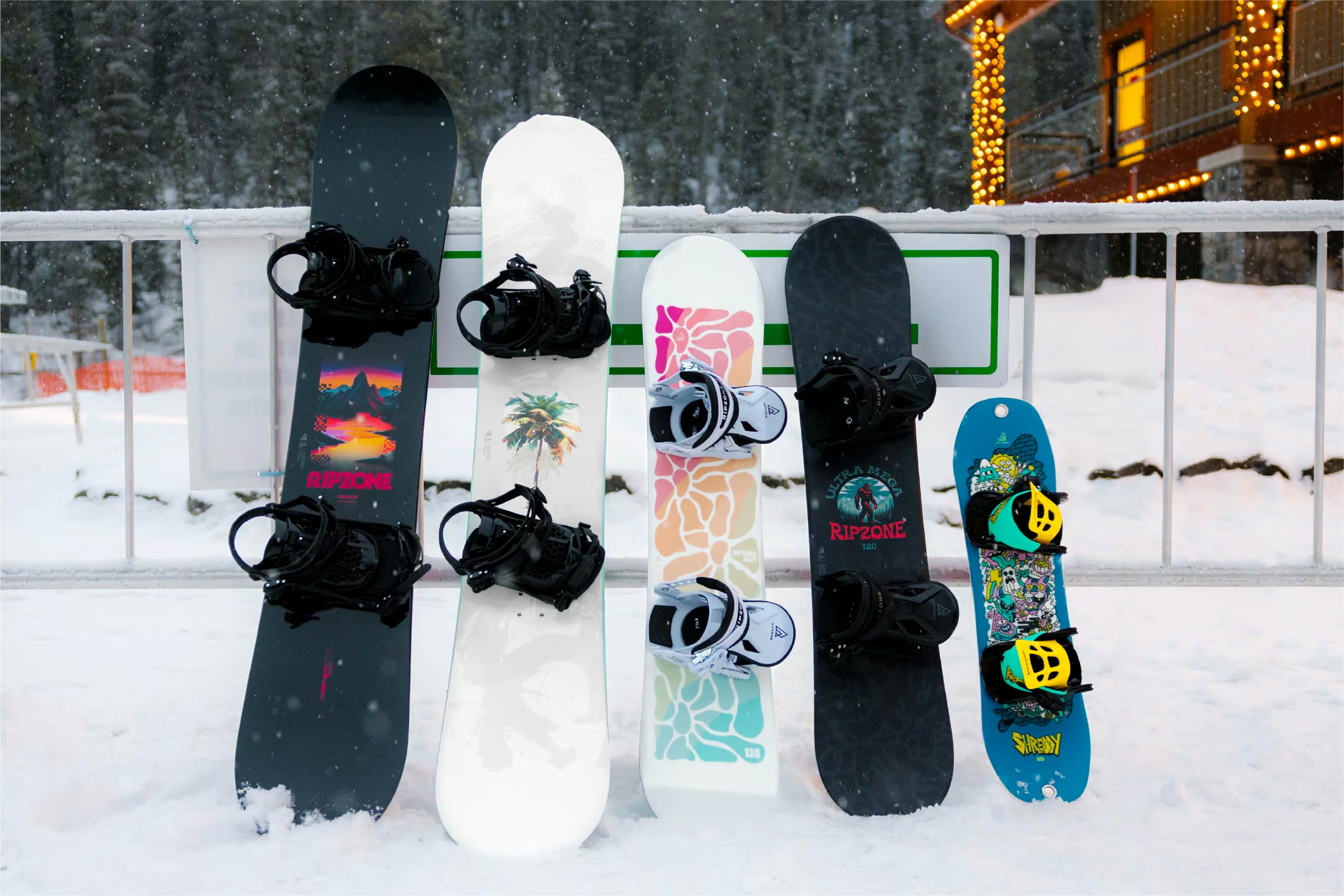
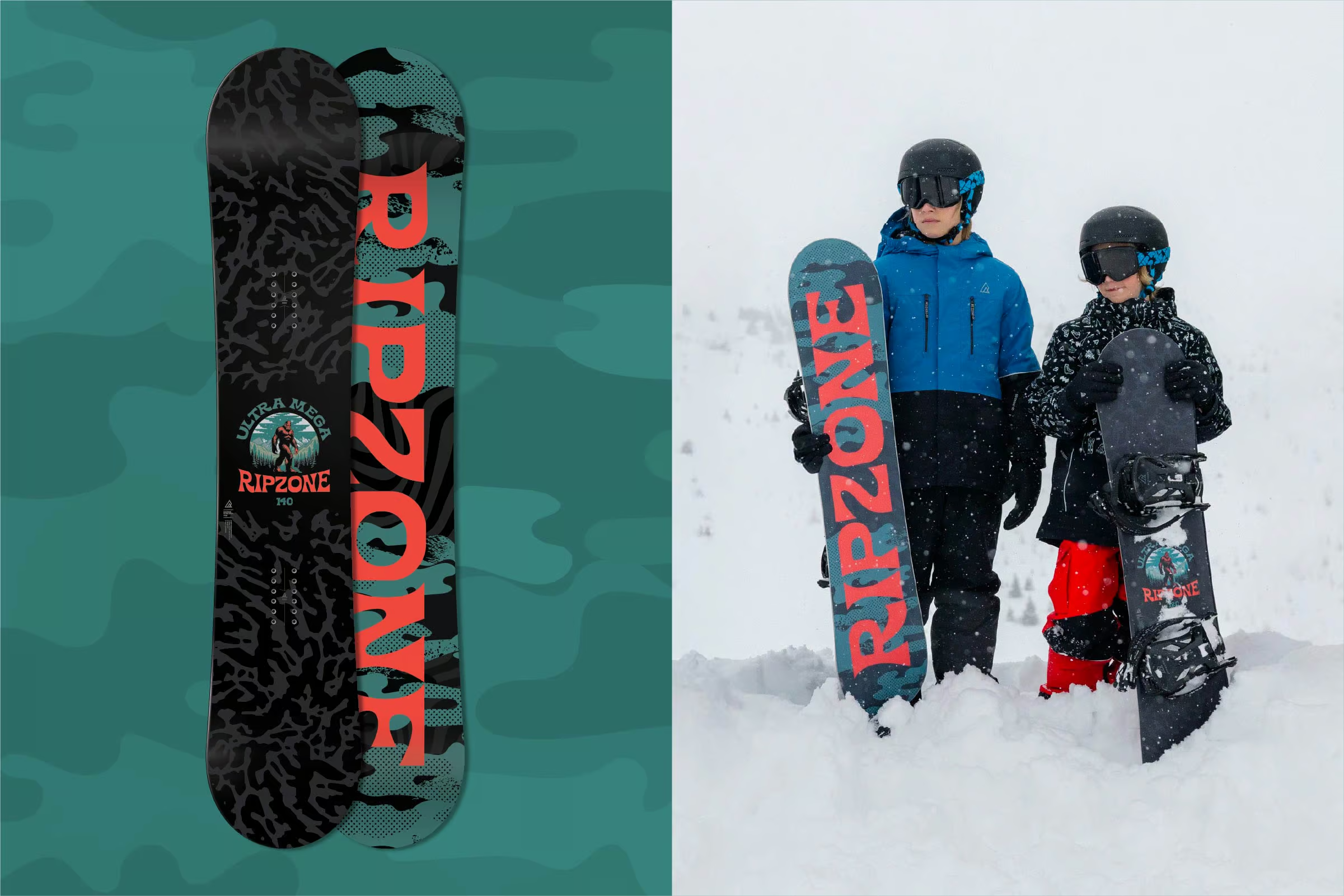
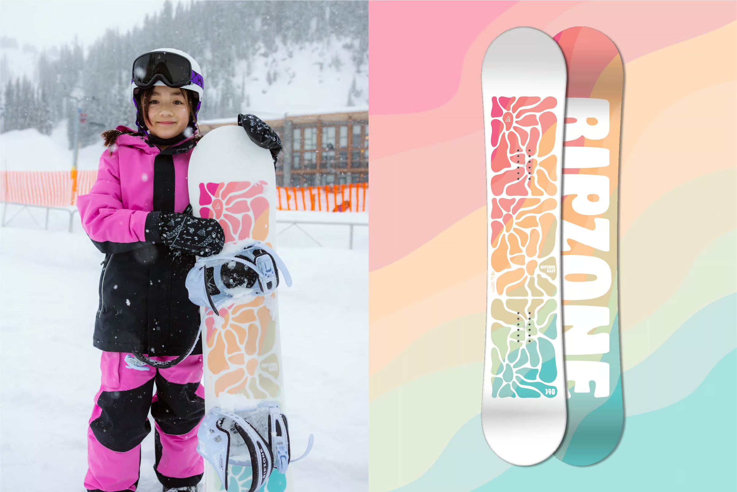
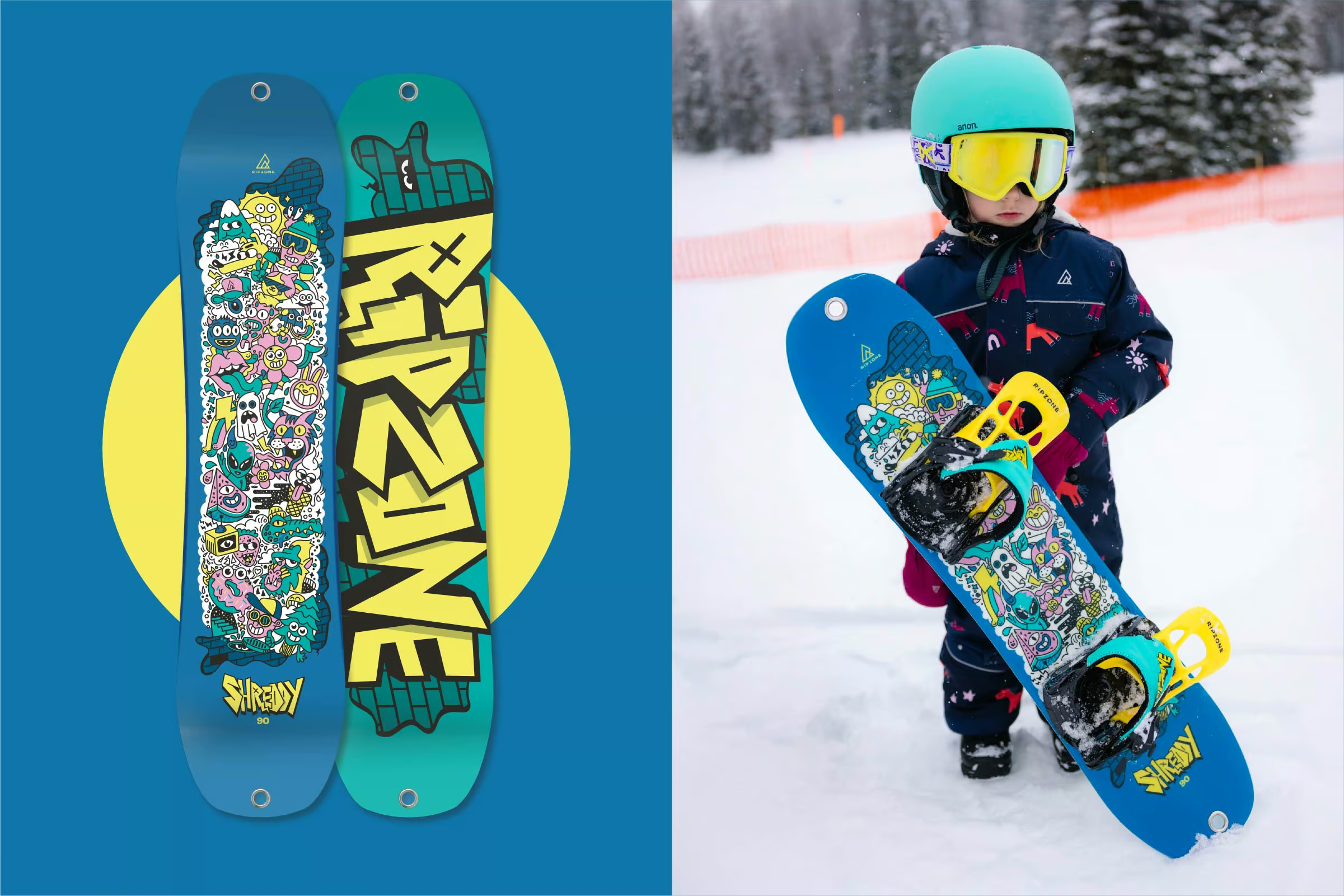
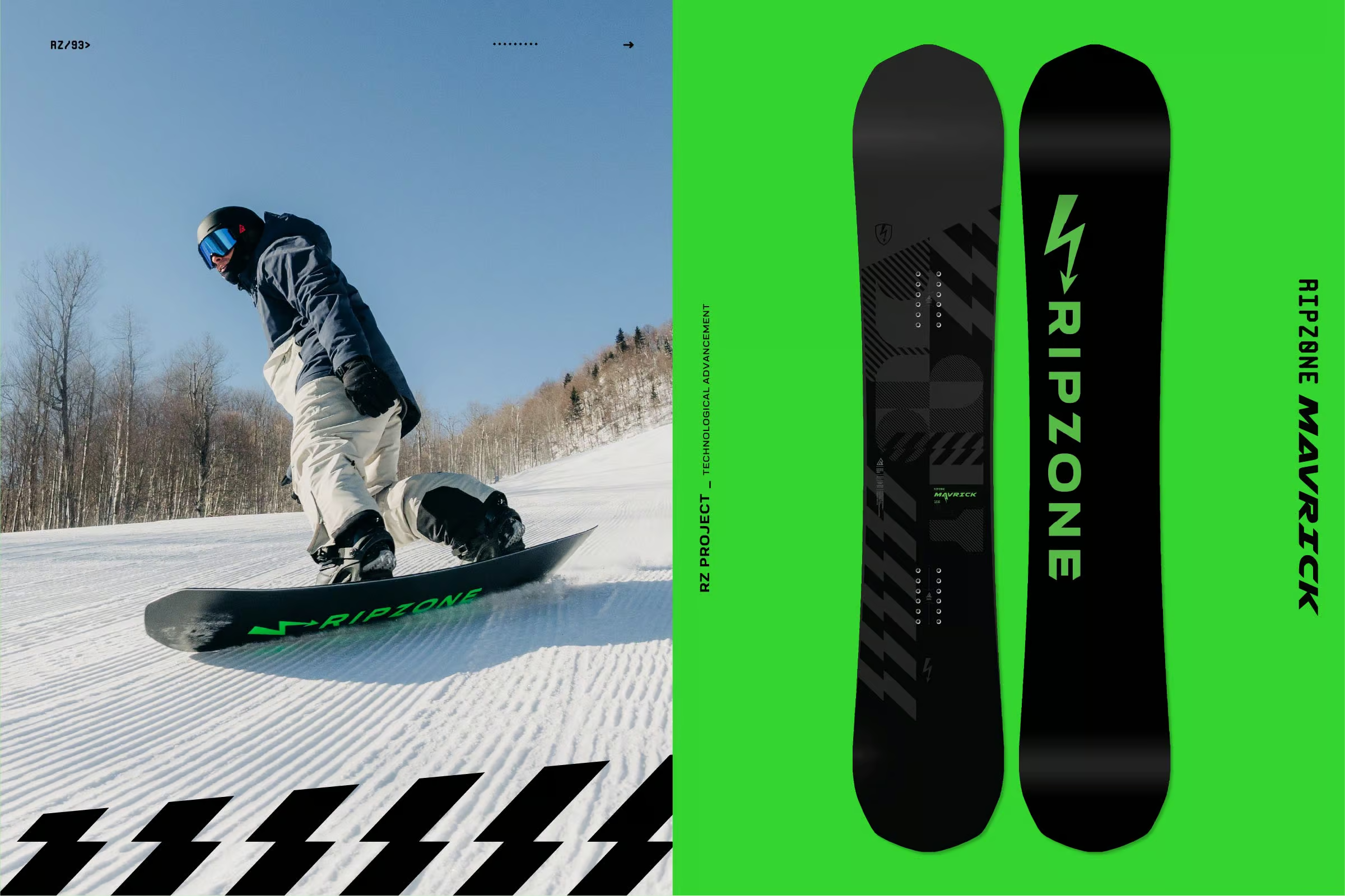
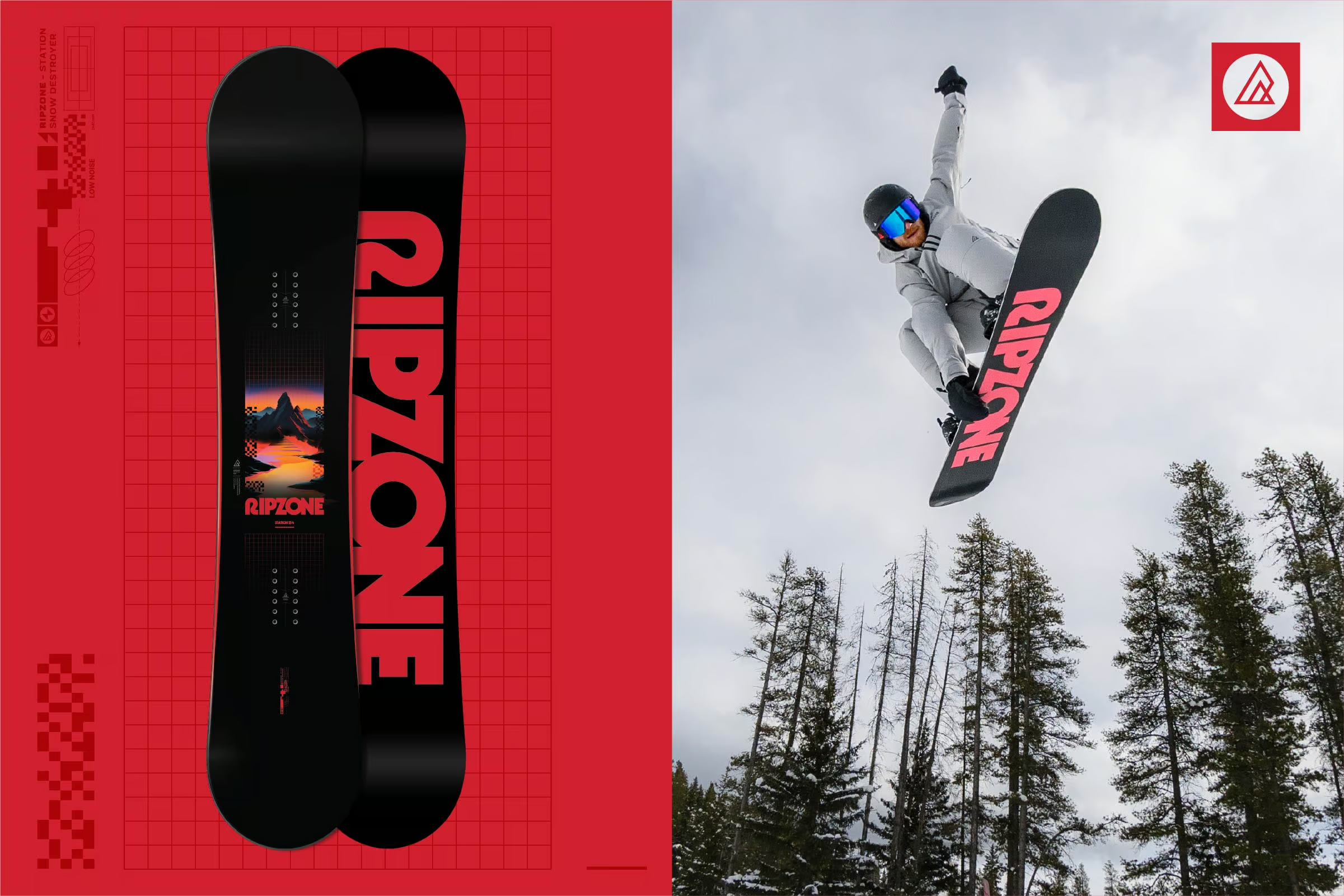
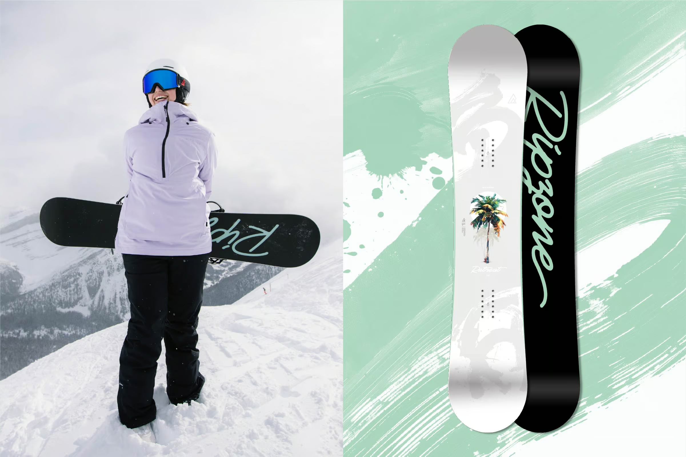
The Ripzone snowboard program has been part of my work since its inception, with boards sold nationally through Sport Chek. The challenge was to create graphics that felt authentic to snowboard culture while remaining accessible to younger and progressing riders. Each board needed to look credible on the hill and make sense at an entry-level price point.
THE SOLUTION:
Season after season, the lineup has grown through original snowboard graphics and a flexible naming system that keeps each release fresh without relying on short-lived themes. The visual direction brings together snowboard culture, product branding, and retail awareness, helping the boards connect with riders and stand out in-store while remaining recognizably Ripzone.