THE OPPORTUNITY:
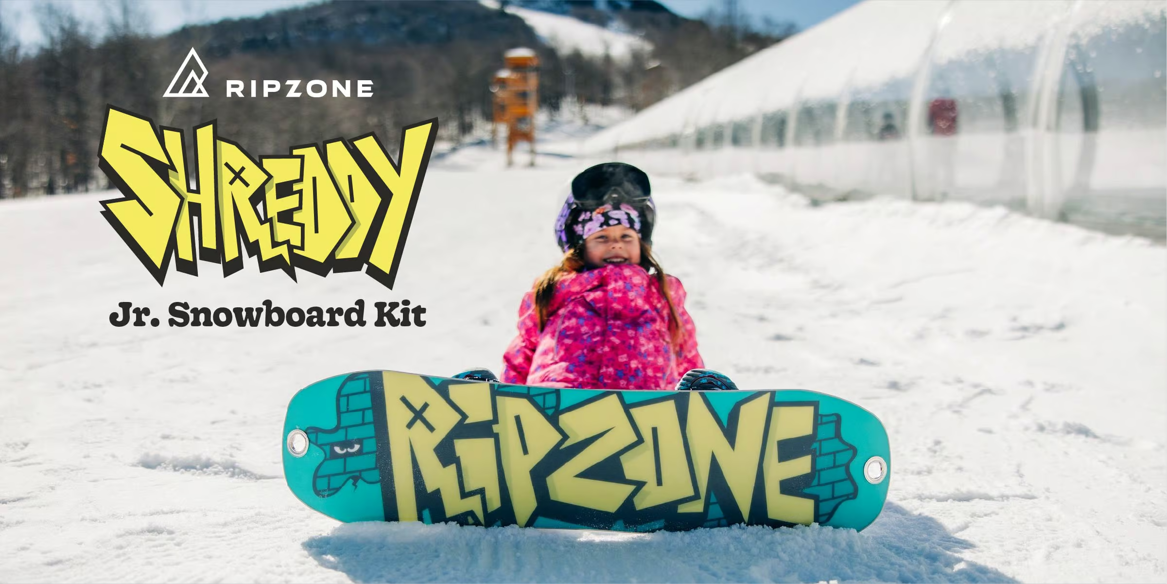
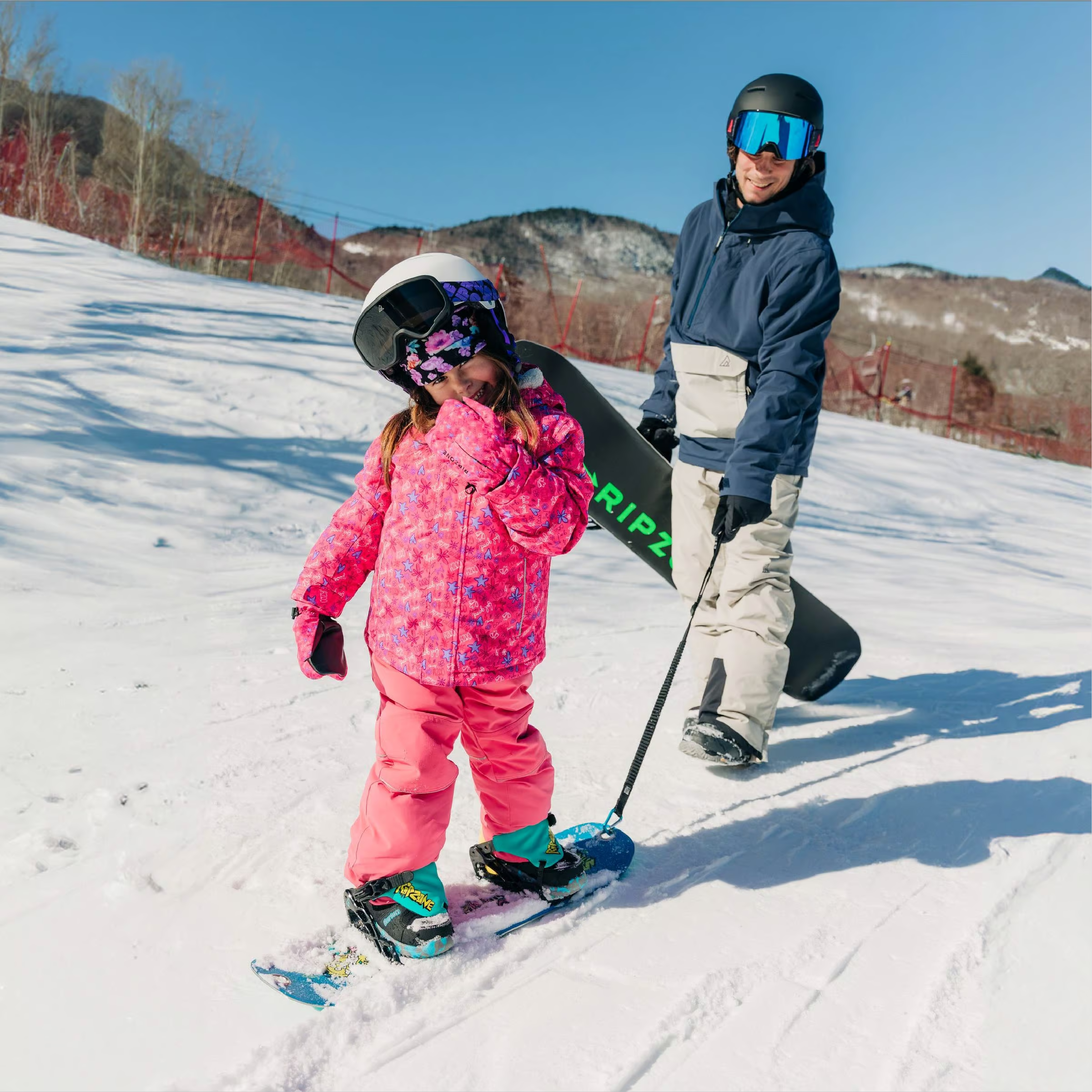
When developing Ripzone’s junior snowboard package, the focus was on creating an identity and visual direction for kids learning to ride. The product needed to feel exciting and true to snowboard culture, with graphics kids would connect with and a complete package parents would feel confident choosing.
THE SOLUTION:
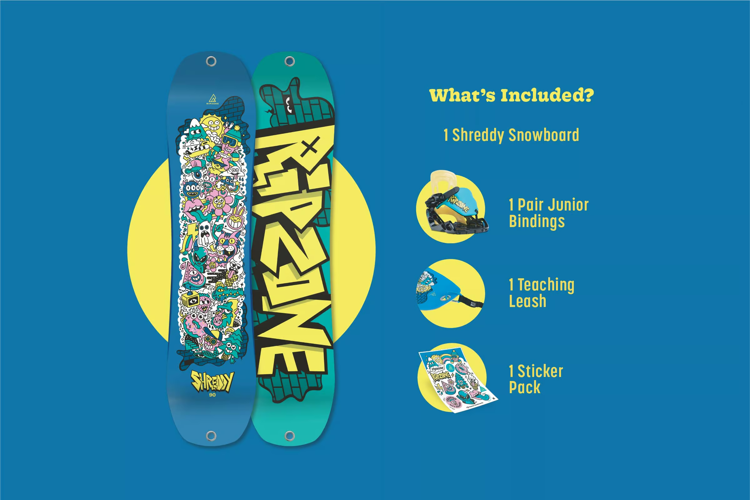
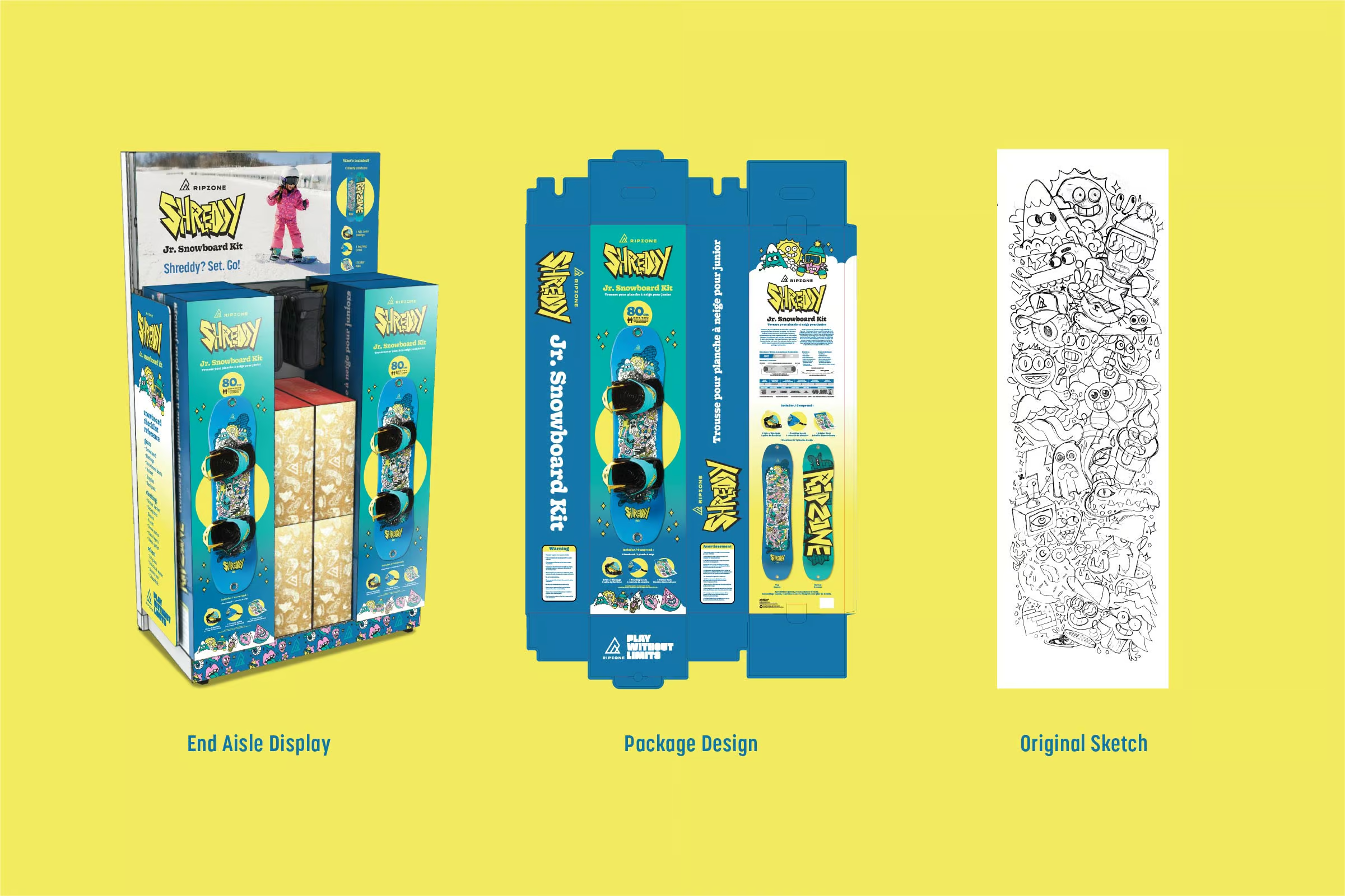
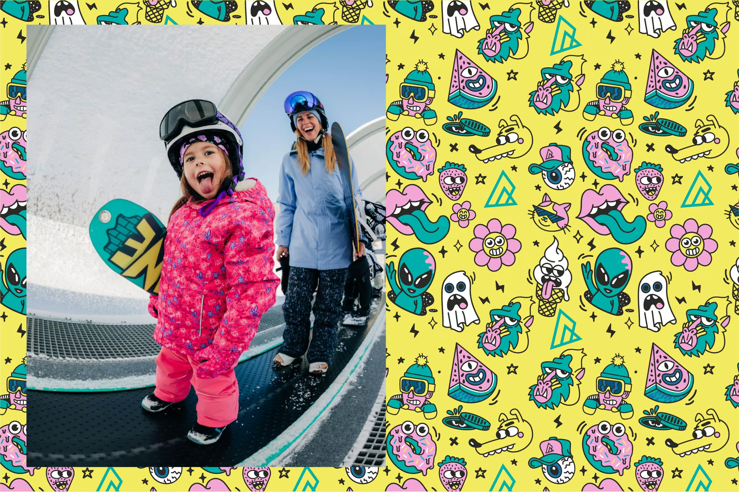
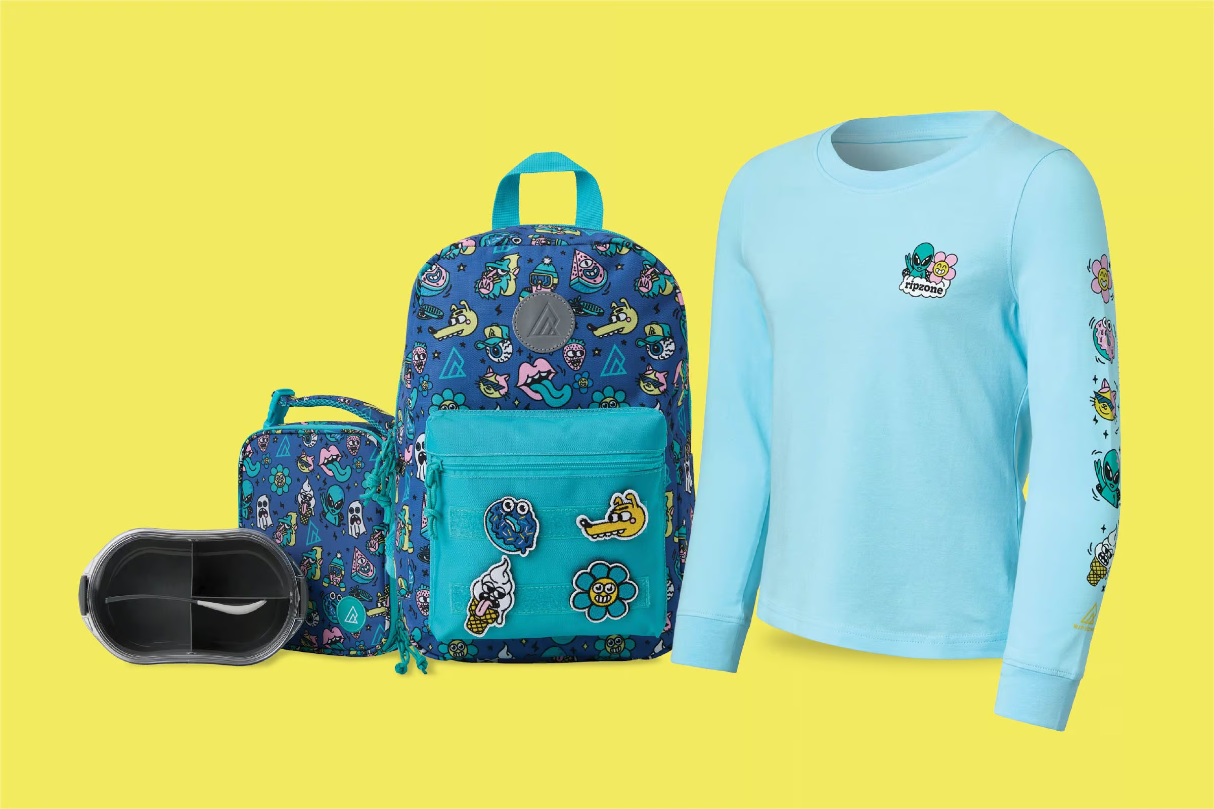
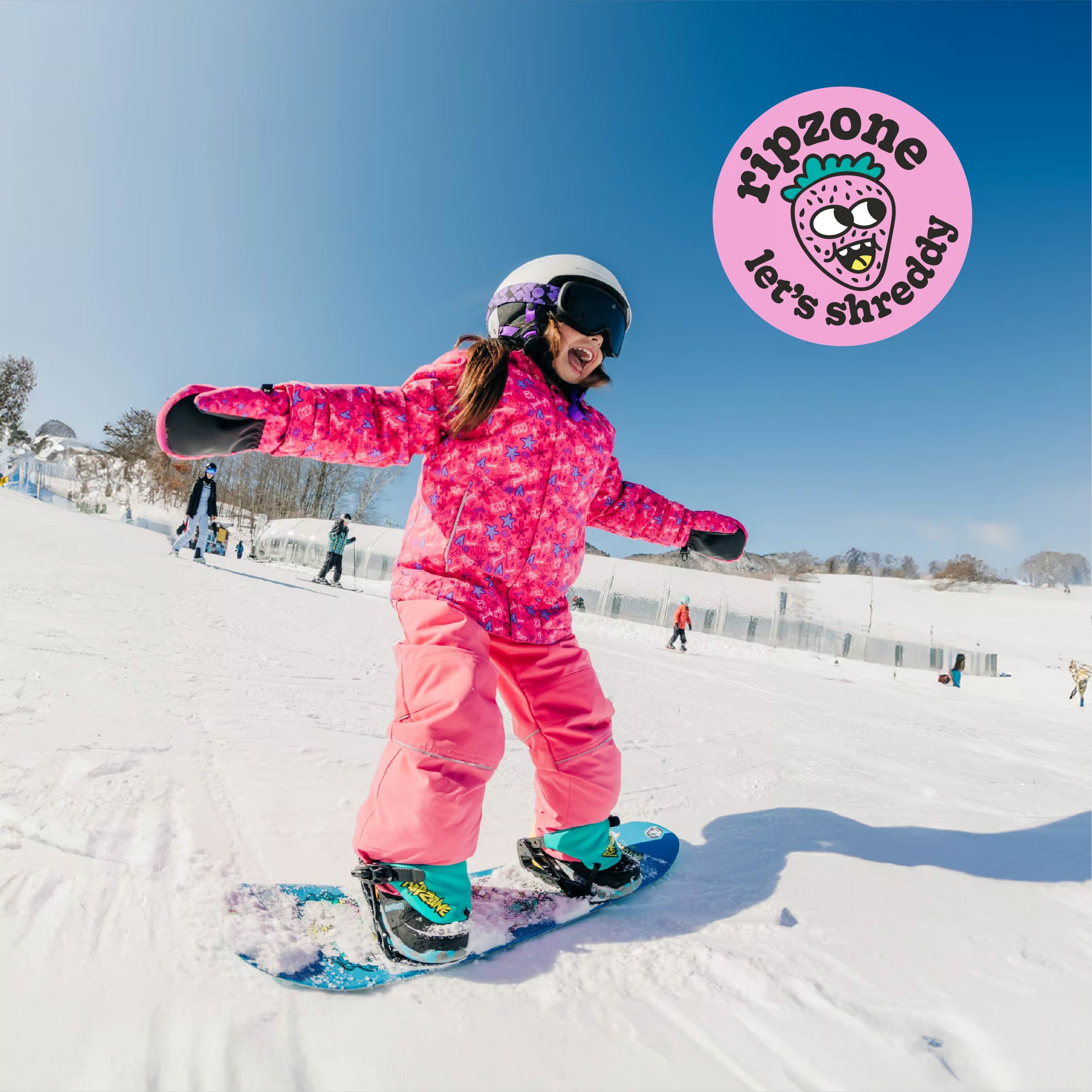
The visual direction brought board graphics, bindings, packaging, and supporting brand elements together as one cohesive kit. The name “Shreddy” came from the idea of a beginner ready to ride, supported by playful character graphics and a gender-neutral colour palette that stood out at retail.
The identity also carried into merchandise and other retail applications, giving the brand room to grow beyond the original snowboard package.